In the last few years, I’ve been almost obsessed with what the current and future topics in the arts are. But I wanted to reflect back to my earliest days as an art enthusiast and the pieces that made me think about art in the first place. There used to be a framed poster Red Poppy by Georgia O’Keeffe hanging in the small cafeteria in my music school. The poster was a promotional image for a 1988 exhibit at the Metropolitan Museum of Art which opened approximately two years after her death and was likely a celebration of her long career. It is the first piece of art that I remember spending a lot of time with and discussing with someone (my father). It was calming to know that I could come back to see it every Saturday at lunch and spend time with it for about an hour for a couple years until the space was renovated.
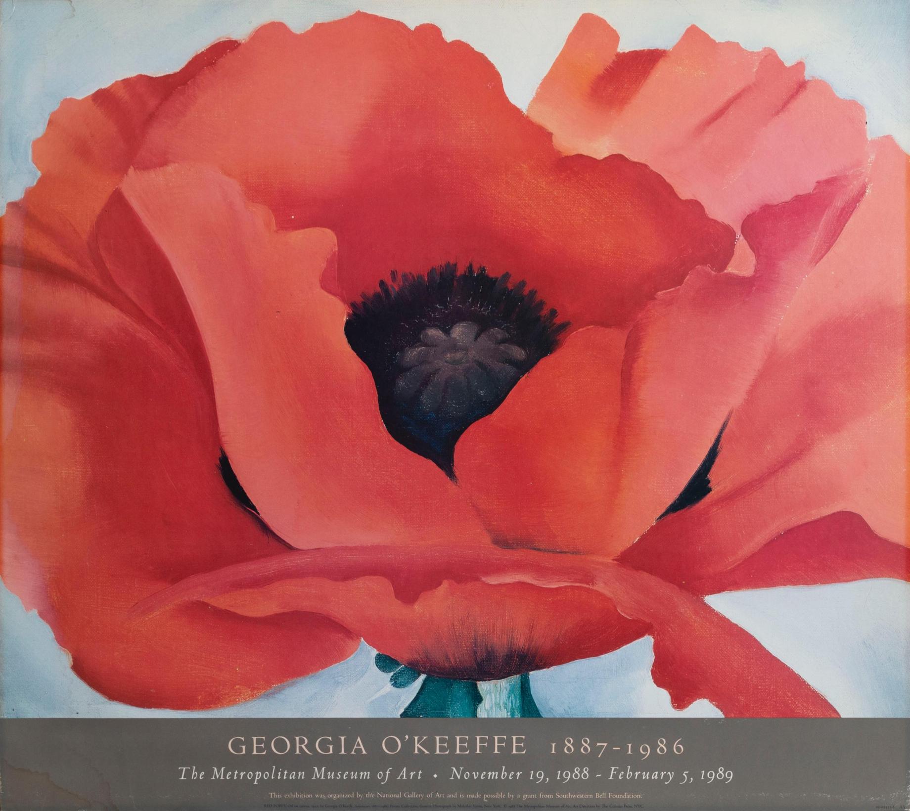
Red Poppy (1927) is an oil painting on canvas depicts a super magnified, singular red flower. Most of what we can see is the bloom itself with just the hint of a blank background and green stem. The colors in the painting are saturated and vibrant. O’Keeffe chose to portray the poppy from 45° from the horizon, an angle from which I also have found I like photographing flowers. From this angle, a majority of the structures are visible with the suggestion of the overall shape of the flower as well. The inner fuzzy black core of the flower is just visible and there are two areas of black peeking out between the red petals that suggest that there is more than we are able to see from this angle.
There is a simple elegance to the piece but as my eye traced the outline of the petals, the piece drew me in. The color contrast is remarkably stark with crisp delineation between each of the elements present. Although abstracted, there are multiple shades of red that create dimension to the petals. O’Keeffe painted at least seven other such paintings. In comparison to some of the other versions of Poppy this particular painting has a demure and graceful quality, possibly because although we can see the flower but certain parts remain hidden (like the rest of the inner core). By contrast, Oriental Poppies (completed one year later in 1928) depicts two poppies from overhead, with their inner core exposed on a red background. I find it to be a much more aggressive expression compared to Red Poppy. I have never seen the actual Red Poppy in person but the scale and colors of the poster demanded attention, so I can only assume that feeling is amplified with the real thing. Of her flower paintings, O’Keeffe herself said:

“If I could paint the flower exactly as I see it no one would see what I see because I would paint it small like the flower is small. So I said to myself – I’ll paint what I see – what the flower is to me but I’ll paint it big and they will be surprised into taking time to look at it – I will make even busy New Yorkers take time to see what I see of flowers. “
Although Georgia O’Keeffe is largely credited as the “Mother of American Modernism”, Red Poppy was actually completed relatively early in her career, which makes it an interesting choice as the poster painting for her first posthumous exhibit. When this painting was created in 1927, she had only been married for three years and moved to New York full time a few years prior. Despite having this knowledge, there is a placeless quality to this work: there is nothing in the painting to suggest where she (and by extension we) are.
Many art critics have intellectualized the Poppy series to be a parable for the cycle and life or death or ascribed a sensuality to O’Keeffe’s pieces. She denied such readings saying that her paintings of flowers were just paintings of flowers. In the art critique world, aesthetically pleasing works sometimes get a bad reputation for being “simply” beautiful. So I think there is something defiant and romantic about putting a lot of time and effort into something that doesn’t have to have a deeper meaning beyond being beautiful. But I also would push back on the idea that this painting is “just” anything. Red Poppy demonstrates that even “simple” beautiful things can be transformed through art to have real visual and emotional impact. This is not the flower we are acquainted with in our everyday lives, it is more vibrant, wild, and yes-quite literally larger than life.
It’s interesting to consider Red Poppy almost 100 years after its completion. As of earlier this month, we are officially back in the “Roaring Twenties”. Usually when I think about that time period, I think of technology modernizing the American city and that is even more true today. The era of the 1920’s and 1930’s are often connected with Art Deco in my mind, with jazz and the constant hustle and bustle of city living. But I had to remind myself that this era in art was not a monolith and while it is certainly true that America was being urbanized and modernized, flowers and nature still existed too. Furthermore, O’Keeffe’s own words suggest that these flower paintings might have been her response against increasingly fast-paced life. Red Poppy is a reminder to appreciate the not-so-tiny beautiful things, and to take a moment to see the flowers.

“Red Poppy” is certainly the creme de la creme of her poppy paintings. I also only know of it via a reproduction. There’s so much power to seeing just one large flower, especially the way she cropped it in this composition. I think it has to do with the perspective and scale that you perfectly describe.
LikeLike