When I walked in to start my first day in a STEM graduate program last Fall, I did not know what to expect. Because I knew since high school that I wanted to pursue a career in the sciences, my parents were perplexed as to why I cared to know the difference between my Rococo and my Renaissance. Still, because I attended a liberal arts university so it wasn’t so odd for my schedule to contain Biochemistry and a seminar on the founding of Disney.
I knew that this was not going to be the case when I got to graduate school and indeed all of my coursework so far has been rooted primarily in biochemistry and genetics. As was to be expected, a Biology degree was useful for navigating those classes. But what I did not know was that the skills I had acquired in my Art History classes would serve me equally as well.
Simply put-being an Art Historian taught me how to critically consider objects. Be it a painting, sculpture or even building, the process for thinking about all of those is the same. We can consider these on two fundamental levels, microscale and macroscale.
On one hand, I have been trained to analyze a piece of art or architecture with laser-like precision and leaving no detail unnoticed. I was trained to take stock of all components of the work and to deconstruct the work to its formal elements. This is when the art historian will tell you what they see. Are you considering a painting? A sculpture? A building? Where is it from? How big is it? What is it made of? No observation is too trivial and unless we are told otherwise, all choice in terms of color and technique are considered deliberate artistic choices by the creator.
On the other hand, much of the art historian’s job is putting an object into the context of the time and society in which it was conceived. It is the art historians job to simply ask questions about the piece. This can be sub-divided into two parts: how the piece was considered in the moment and how it is considered now. How did the artist make the piece? How would the piece be used? Who would have used the object-the rich, the poor? This is where the art historian will try to paint the social and political scene of the time in which the art was created, how it was influenced by work of the past (and if it is old enough), how it influenced future works.
In many ways, the things we have addressed above are going to be shared observations by anyone who has seen the piece and done some research. But this last facet is hugely personal; the last part we need to consider is how that piece relates to our time and place. Is it problematic? (Probably.) Why? What can we learn from it?
From these three disparate parts, we as art historians form a narrative about a piece and unsurprisingly, this is also the job of a scientist. The connection may not seem as apparent but while all the work requires an in-depth knowledge of techniques, buffers assays and what have you, the presentation of said work is where all these elements come together.
Scientific findings are predominantly presented in the form of an article published in a major journal. While there are lots of words that explain exactly what is going on in any particular article, most people really just look at the pictures (especially if you are a graduate student plagued by impending deadlines). Although the exact guidelines vary from journal to journal, there will often be 4-10 pictures accompanying the text and each image will contain a caption explaining what exactly you are supposed to learn from the image. The main objective of these figures is informative but there are also two other elements that I did not consider during my undergraduate science career.
It is true that graphs are hardly ever considered “artistic” per se but aesthetics actually play a key role in designing figures. Often, the Scientist will have to figure out the best way to show their data to convince you of their argument. I have had very spirited conversations about graph color lines, how much to spread or compress data, whether one way of showing the data is superior to another. While there are fairly set standards and expectations for some figures, but there is also some wiggle room for personal design and a flair for the dramatic in order to make the strongest point possible.
The second aspect concerns the craftsmanship of a narrative. Usually a journal article will be the culmination of months, if not years, of hard work. How do you summarize that into a paragraph and four images? How do you summarize that to people who have not spent years doing background research, performing tests on late nights and troubleshooting experiment after experiment? By very carefully curating that limited amount of space and words. Often, the order of the data you see is not the order of the experiments as they were performed. Science is a meandering process but by the time you receive your issue of Cell, it should look streamlined, concise and condensed.
While I will always hold a special place in my heart for strictly art history classes, I was heartened to find out that the skills I honed writing those papers were not for naught and actually have translated well into my study of the sciences.
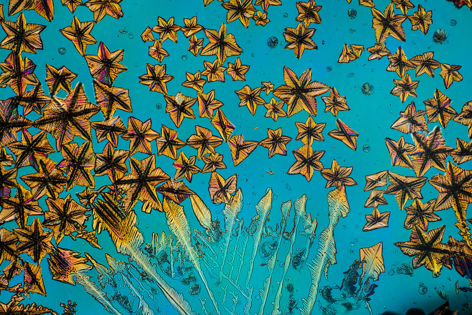
Cover image: Submission for the 2015 Nikon microscopy Contest from Dr. Ryoji Tanaka
