
Edited by Catherine Harlow, Katie Constantine, and Kathryn Cooperman.
Cover Image by Joshua Coleman
The most highly anticipated exhibit in Boston this spring wasn’t at the MFA, but instead in an old retail space on Boylston Street. Happy Place is a pop-up that has traveled from LA to Toronto and has finally come to Boston. The exhibit explicitly seeks to induce joy by visitors basking in a set of rooms painted in really bright colors with twee themes. Implicitly, it is supposed to look cool so that people post pictures on Instagram and make it go viral IRL. But because the space focused so much on conspicuous consumption and projecting joy on social media, it felt less effective at inspiring true joy. Added to this, Boston is not a city impressed by superficiality. So although Happy Place was heavily promoted on social media and by influencers and met with great initial excitement, this exhibit was all style and little substance.
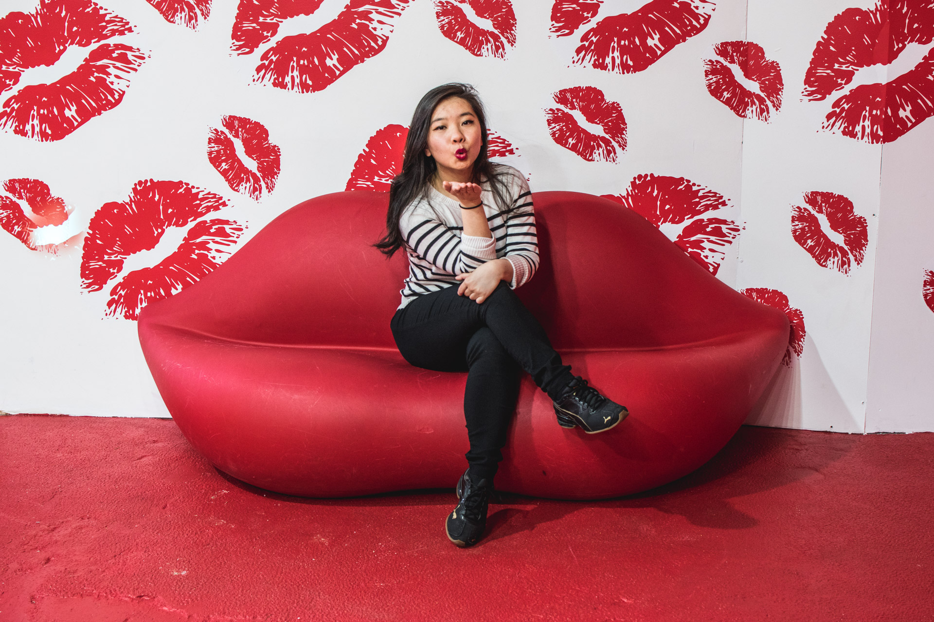
When I visited Happy Place on a Saturday morning, I expected to see mostly social media personnel, the crowd consisted mostly of small children and their parents. The space consisted of many cramped, themed rooms–some areas were just corners of rooms and cubbies. Because these visual vignettes were tall and narrow, they seemed to have been designed with the tall and skinny views of cell phone cameras in mind. There were a few different themes, each in bright! primary! colors! There were rooms dedicated to candy, cookies, and even a complete upside down room. They even used a hallway space with lighted signs saying “don’t worry be HAPPY” as photo-op location. Two of the most interactive highlights from social media campaigns were a clear bucky ball filled with confetti and a giant ball pit.
Because the entire experience felt like it was planned out for me already (overly manufactured and produced), it was frustrating to not have the space of time to create pictures that felt unique to me (literally and metaphorically).The exhibit on the whole was processional. You are ushered by staff from one space to another and there is not that much freedom to go backwards or explore or meander. Ideally, a visitor would have one walk through to experience a space and plan out shots and then a second walk through to actually get them! But then again, maybe prolonged viewing wouldn’t be too helpful since I felt that the props were one-dimensional and somewhat uninspired. It was a little comical to watch as other visitors tried to figure out exactly what we were supposed to do when the photo concept is literally just plastic chains hanging from a ceiling.
One of the least successful rooms in the exhibit was the Giant Bloom Room, a raised field of bright yellow flowers in an otherwise pitch black room. The lighting was laughably poor, which only a couple harsh stage lights illuminating the room. Even the simple addition of twinkle lights in the flowers or softer overhead lighting could have significantly improved the quality of photographs. Even with a semi-professional camera and lens, with all settings trying to optimize incoming light, I found it super challenging and discouraging to try and fail to get the photos that I wanted. And if that was happening to me, I can only imagine how a phone camera would handle the situation. Needless to say, very few of the posts on social media are coming from this particular room. The concept was incredibly underwhelming considering how easy it was to get pictures in the earlier rooms had been with their poppy colors and bright lighting. This dark room not only was unsuccessful as a standalone designed space but it certainly didn’t fit the over-the-top exuberance of the rest of Happy Place.
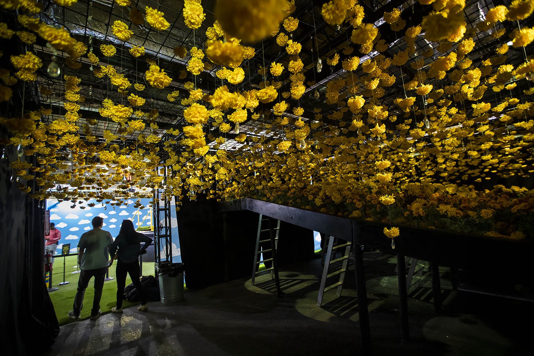
TC Note: As you might notice, the main source of light for this picture is from the next room over…
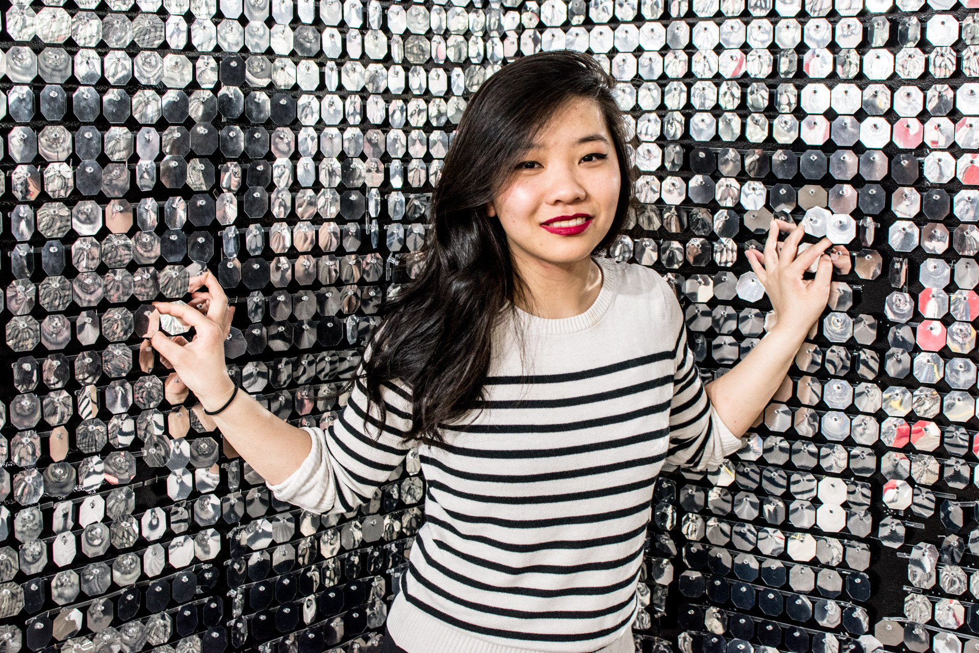
Happy Place wasn’t a complete waste of resources, since I am pretty happy with some of the pictures I got from the exhibit. Regardless of who you are or what gear you are using, this is one way to all but guarantee usable photos from at least one of the rooms. But although I really wanted to like the exhibit’s concept, I learned that it just didn’t fit my camera or shooting style. A lot of what I like about photography is the hunt, being in the perfect place at the perfect time to get the right shot. Or finding something everyone else overlooks. Frankly, the photos we got look exactly like everyone elses’. Compared to other similar Instagram trap exhibits (pop-up exhibits designed explicitly for social media posts), Happy Place lacks the weight an exhibit like 29Rooms, by Refinery29, which showcases the work of female designers. As a creative experience, Happy Place feels one-dimensional.
Overall, I’m not surprised that Happy Place has been unpopular with Bostonians. To my knowledge, this is the first exhibit of its kind to come to Boston. Instagram traps have historically been more popular in LA or NYC. But when I think about the content Boston bloggers are producing, a lot of it has to do with deeply associating themselves with Boston the CITY. And our city is not bright yellow. Happy Place is a traveling pop-up so whether it’s in Toronto or here, it will look the same. While the aesthetic of Happy Place may match cities in the West that are typically more colorful, it’s a pretty big departure from the architecture of Boston, even with the giant Dunkin Donuts advertising photo-op near the cafe area. We lose that locality of knowing that our photos are grounded in the city of Boston and ONLY Boston, rather than some studio lot anywhere in the world.
Happy Place requires several key edits to be successful, especially with a Boston audience. I would have really appreciated fewer, more intentional room concepts. Larger spaces could be designed to better encourage creativity, exploration, and play. I felt really rushed moving through the rooms so I couldn’t really experiment with the spaces and get pictures of my friend in them because it would clog up the flow. I felt like my creativity was stifled a little bit because of the time and space constraints. If no changes are implemented, I would certainly recommend they lower the price. The admission is really steep for what it is ($35, double the price of admission to the Museum of Fine Arts), a sentiment echoed by the Boston Globe. One positive outcome of this experience was that by seeing how everyday objects could be transformed into portrait backgrounds, Happy Place inspired me to think about ways that I can do interesting portraiture (for little or no money to counter the price of admission).
Some aspects, like the ball pit and confetti dome, were fun. But between being a Thing to Experience and Thing to Photograph, Happy Place falls into a weird uncanny valley. But even those don’t actually seem like they were focused on the experience of it (the balls pit was incredibly uncomfortable and I couldn’t wait to get out of it). The hurried nature of the user’s experience definitely also detracted from the joy and playfulness. I felt pressure to get the shots but I didn’t have the time I wanted to do the exhibit full justice. Due to the lack of light and other design elements, it didn’t seem as though the space was designed explicitly for photoshoots. But without cameras, Happy Place just isn’t engaging enough to be its own experience. Unfortunately, Happy Place embodied the aesthetic of joy but not the spirit.
